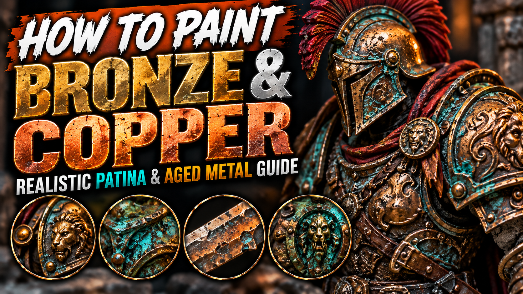
How to Paint Bronze and Copper on Miniatures (Realistic Patina & Aged Metal Guide)
Bronze and copper are some of the most interesting metals to paint on fantasy miniatures because they offer much more color variation than ordinary steel or silver.
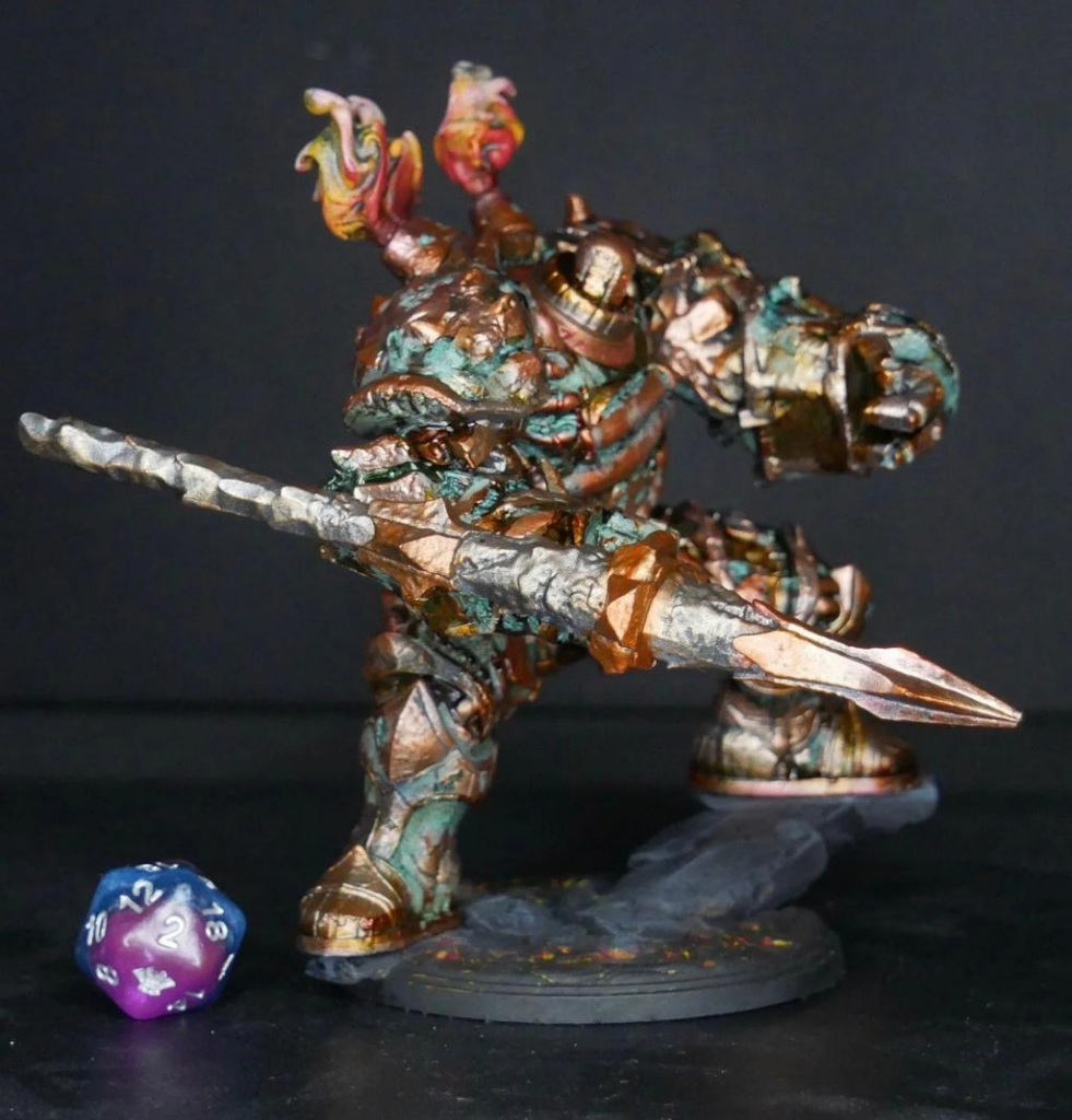
Ancient armor, statues, shields, weapons, machinery, temple decorations, coins, jewelry, and dungeon scenery can all benefit from bronze or copper finishes. Better yet, these metals can develop patina over time, introducing turquoise, green, blue, and even white deposits across the surface.
That combination of warm metallic colors and cool oxidation creates incredible visual contrast.
The key is avoiding a simple metallic brown base coat. Convincing bronze and copper require shadows, warm reflections, edge highlights, discoloration, and carefully controlled weathering.
In this guide, you’ll learn how to paint clean bronze, aged copper, realistic oxidation, verdigris, and ancient metal suitable for almost any fantasy miniature.
Understanding Bronze and Copper
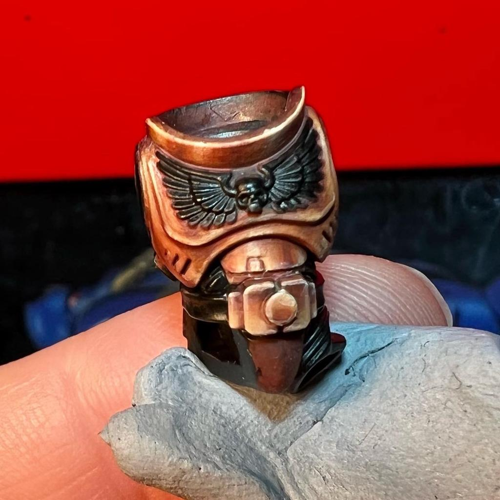
Copper has a naturally warm appearance.
Fresh copper contains rich orange, reddish-brown, and golden tones. As it ages and reacts with the environment, the surface becomes darker and eventually develops green or turquoise oxidation.
Bronze behaves similarly but generally appears slightly darker, browner, and less intensely orange.
For miniature painting, you can exaggerate these differences.
Fresh copper can contain bright orange metallic highlights.
Ancient bronze can be dominated by dark brown with subtle gold highlights.
Heavily oxidized metal can contain dramatic turquoise deposits.
Understanding this progression makes it much easier to decide how old you want the object to appear.
Choosing Your Bronze and Copper Palette
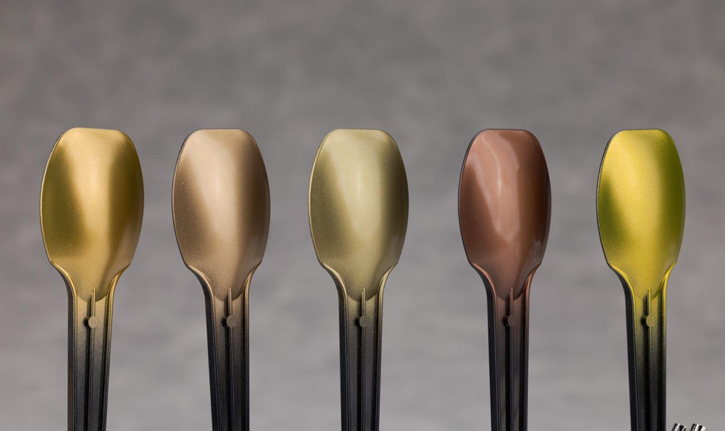
A useful bronze palette usually contains dark brown, bronze metallic paint, copper, gold, and a bright silver or pale metallic highlight.
For aged metal, add turquoise, blue-green, dark green, and pale turquoise.
You don’t need every color on every miniature.
A relatively clean warrior might have mostly bronze armor with only tiny amounts of oxidation around rivets.
An ancient statue abandoned for centuries could be almost completely covered with green and turquoise patina.
Think about the history of the miniature before choosing how much weathering to add.
This makes the final result feel intentional rather than random.
Starting with a Dark Base Coat
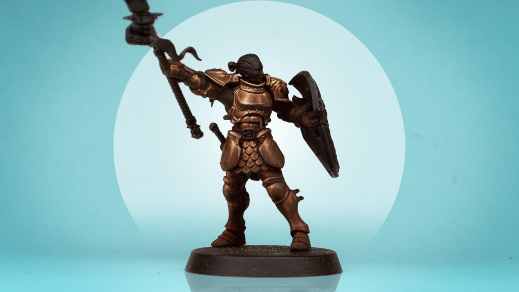
Begin with a dark foundation.
Dark brown works extremely well beneath both bronze and copper.
You can also use brown mixed with black, dark red, or even deep purple depending on the atmosphere you want.
The dark foundation serves two purposes.
First, it provides natural shadows between armor plates, decorations, and recesses.
Second, it creates contrast against the brighter metallic layers you’ll add later.
Make sure the base coat reaches every recess.
Small dark lines left between metallic sections make armor much easier to read.
Painting the First Bronze Layer
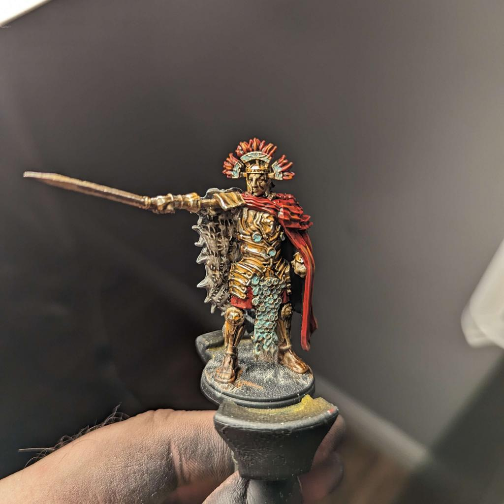
Apply your bronze metallic color over the raised surfaces.
Avoid completely covering the dark base coat.
Leave brown visible in recesses, underneath armor plates, around rivets, and between decorative elements.
Thin metallic paint slightly if necessary.
Several controlled layers usually create a smoother result than one thick coat.
At this stage, the metal should already be recognizable as bronze, but it will probably look relatively flat.
That’s normal.
The next stages create the depth.
You can also vary the metallic color slightly across larger surfaces. Mixing a little copper into selected areas creates warmth, while adding darker brown can break up perfectly uniform armor.
Adding Warm Copper Tones
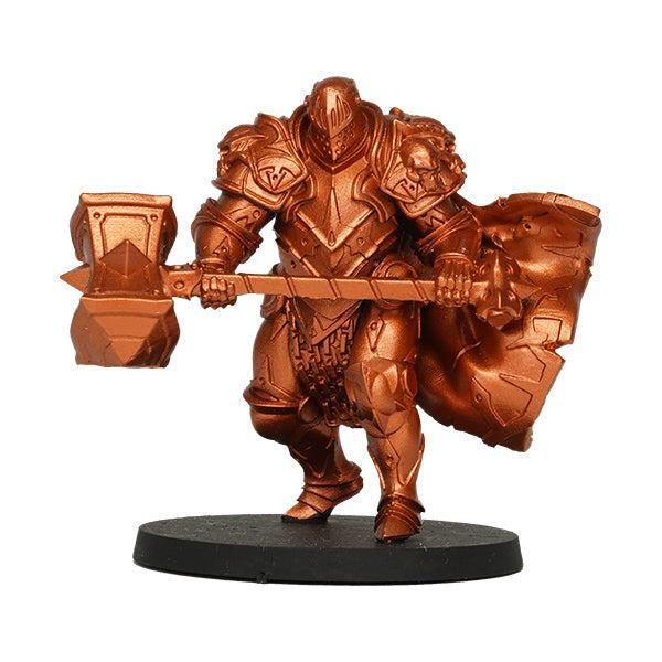
Copper is excellent for introducing warmth.
Apply copper selectively to exposed areas rather than covering the entire bronze surface.
Good locations include raised decorative details, helmet edges, shoulder plates, shield ornaments, weapon fittings, and areas that receive more light.
The reddish-orange quality of copper contrasts beautifully against darker bronze shadows.
You can increase this variation further using very thin reddish-brown or orange glazes.
These subtle color changes make the metal feel more complex.
Real aged metal rarely has one perfectly uniform color.
Shading Bronze and Copper
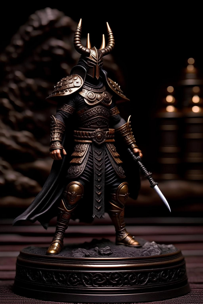
Metallic surfaces need strong shadows.
A dark brown wash is usually an excellent starting point.
Apply it into recesses and around sculpted details.
You can also introduce black selectively into the deepest areas.
For richer bronze, experiment with red-brown or purple-brown shadows.
These colors complement the warm metallic surface without making everything simply black.
Once the shade is dry, restore some of the original bronze across raised areas.
This prevents the wash from making the entire miniature dull.
The strongest shadows should remain underneath overlapping armor and inside deep recesses.
Highlighting Bronze Metal
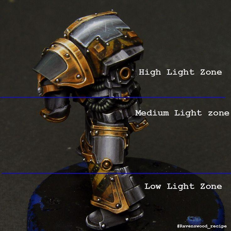
Metal needs strong reflections to appear convincing.
Begin by mixing a brighter metallic color into your bronze.
Apply this to raised surfaces and edges.
Then introduce gold or a pale metallic tone on smaller areas.
For the brightest reflections, you can mix a tiny amount of silver into your highlight color.
Keep these final highlights extremely selective.
Corners, sharp edges, rivets, scratches, and raised ornaments are ideal locations.
Avoid highlighting every edge equally.
Some surfaces should remain dark.
This creates much stronger contrast and makes the metal appear genuinely reflective.
Creating Realistic Patina
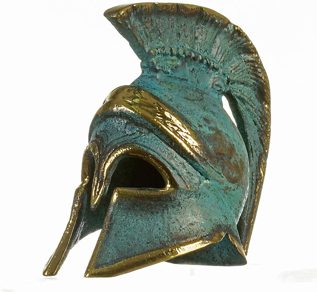
Patina is where bronze and copper become particularly interesting.
Copper oxidation often creates blue-green or turquoise deposits commonly associated with aged statues, roofs, coins, and ancient objects.
Begin with a dark turquoise or blue-green.
Thin the paint significantly and apply it into recesses.
Good locations include around rivets, underneath armor plates, inside engravings, around joints, and anywhere moisture could naturally collect.
Do not cover the entire metallic surface.
The bronze should remain visible underneath.
Once the darker turquoise is dry, introduce a brighter turquoise into smaller areas.
Finally, add tiny pale turquoise highlights to the strongest deposits.
Making Verdigris Look Natural
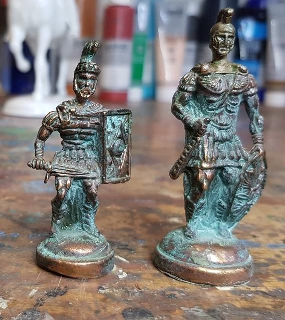
Randomly painting turquoise spots across bronze rarely looks convincing.
Instead, think about where oxidation would accumulate.
Recesses naturally hold moisture.
Water can collect underneath raised decorations.
Oxidation often forms around joints, cracks, rivets, and damaged surfaces.
Use gravity as part of your weathering.
On statues or large armor panels, you can create subtle vertical streaks extending downward from oxidized areas.
Keep these irregular.
Some sections can contain strong turquoise while others have only a slight green tint.
Variation is essential.
The goal is to make the patina look like something that developed gradually over time.
Painting Ancient Bronze Armor
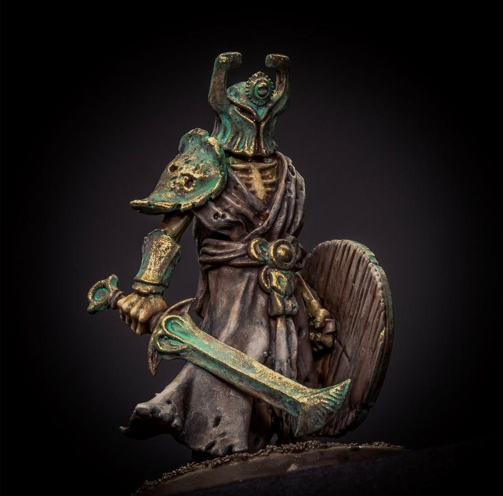
Ancient bronze should usually contain much more visual variation than newly polished armor.
Start with the same dark brown foundation.
Apply bronze unevenly, allowing some areas to remain darker.
Add copper and gold selectively.
Then introduce patina into recesses.
You can also add scratches and worn edges.
Use a brighter metallic color to paint thin lines along exposed areas.
Place a small dark line immediately beneath selected scratches to increase their depth.
The combination of oxidation and fresh scratches tells an interesting story.
The armor might be ancient, but recent damage can reveal cleaner metal underneath.
Painting Bronze Statues
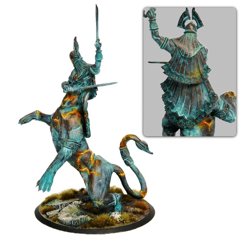
Statues provide an opportunity to push oxidation much further.
Begin with extremely dark bronze.
Add irregular metallic highlights across raised areas.
Then apply blue-green and turquoise into recesses.
For a heavily weathered statue, you can allow the patina to cover much larger portions of the surface.
Faces, folds, engravings, and lower areas can accumulate particularly strong oxidation.
After the patina is finished, restore a small amount of bright bronze to the most exposed surfaces.
This suggests that contact, weather, or friction has polished those areas.
The contrast between turquoise patina and bright bronze can create a spectacular ancient effect.
Painting Copper Weapons
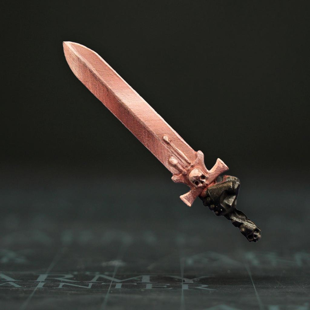
Copper isn’t normally associated with fantasy swords as strongly as steel, but it works beautifully on ceremonial weapons, magical equipment, steampunk machinery, and decorative weapon components.
Use dark brown around the deepest areas.
Apply copper across the main surface.
Introduce brighter orange-metallic tones toward exposed edges.
Then use small gold or silver highlights for the strongest reflections.
If the weapon is ancient, place subtle turquoise oxidation around engravings and near the handle.
Keep the cutting edge relatively clean if you want the weapon to appear actively used.
That contrast creates visual storytelling.
Adding Scratches and Worn Edges
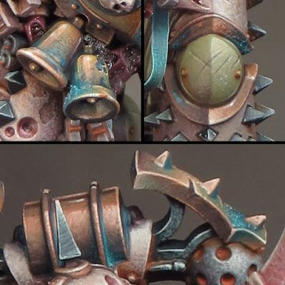
Weathered bronze becomes more convincing when oxidation is combined with physical damage.
Use a dark brown to paint small scratches.
Then place a thin bright metallic line along the lower edge of selected scratches.
This creates the illusion that the surface has been cut deeply enough to expose cleaner metal.
For worn edges, lightly apply brighter bronze or gold to corners that would experience repeated contact.
Shield rims, weapon handles, armor edges, and raised decorations are ideal locations.
Don’t add damage everywhere.
A few carefully positioned marks are usually more convincing than covering every surface.
Combining Bronze with Other Materials
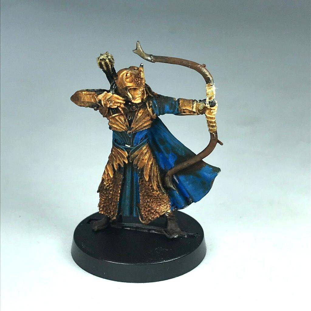
Bronze becomes even more impressive when placed beside contrasting materials.
Dark leather emphasizes the warmth of bronze.
Blue cloth creates strong color contrast.
Red fabric produces a rich classical fantasy appearance.
Stone and marble work beautifully with bronze statues.
Turquoise magical effects can visually connect with verdigris while remaining brighter and more saturated.
When designing the miniature’s overall palette, avoid making every material warm brown.
If you have bronze armor, brown leather, brown boots, and a brown base, the miniature can become visually muddy.
Introduce cooler colors somewhere to balance the composition.
Common Mistakes When Painting Bronze and Copper
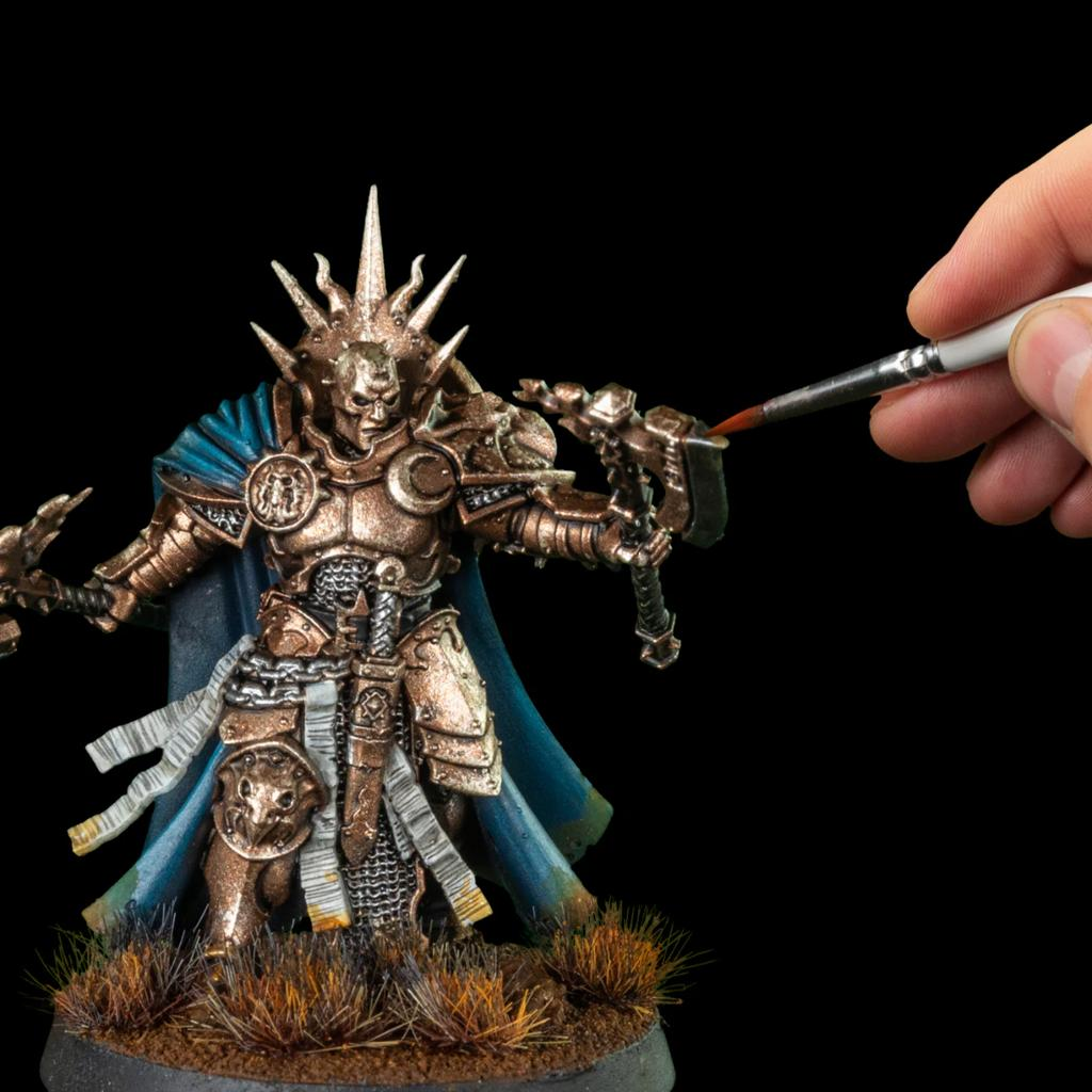
One common mistake is painting the entire surface with one metallic bronze color and stopping there.
Metal needs contrast.
Use dark recesses and bright reflections.
Another problem is adding too much patina.
If almost everything becomes turquoise, viewers may no longer recognize the underlying bronze.
Leave enough metallic surface visible to establish the original material.
Avoid distributing oxidation randomly.
Concentrate it around recesses and areas where moisture could accumulate.
Finally, don’t make every highlight gold.
Bronze contains warm colors, but extremely bright reflections can become almost pale metallic or silver.
That small amount of cool brightness dramatically increases the metallic appearance.
Final Thoughts
Painting convincing bronze and copper is all about balancing warm metal, dark shadows, bright reflections, and cool oxidation.
Start with a dark brown foundation.
Build bronze and copper gradually while preserving deep shadows.
Introduce gold and pale metallic colors only on the most exposed surfaces.
If you want aged metal, add turquoise patina selectively around recesses, joints, rivets, engravings, and areas where moisture would naturally collect.
Then use scratches and bright worn edges to suggest the history of the object.
These techniques work particularly well on ancient warriors, fantasy armor, statues, temple scenery, shields, weapons, machinery, dungeon decorations, steampunk miniatures, and archaeological terrain.
Most importantly, don’t make every piece of bronze equally weathered.
A freshly polished shield, an ancient abandoned statue, and a thousand-year-old dungeon door should all tell different stories through their surfaces.
Once you begin treating weathering as part of the miniature’s story rather than simply another painting effect, bronze and copper become some of the most enjoyable materials to paint.
Frequently Asked Questions
What is the difference between painting bronze and copper?
Copper usually appears warmer and more orange-red, while bronze tends to be darker, browner, and slightly more muted.
What color should I use underneath bronze paint?
Dark brown is an excellent foundation. Black, red-brown, or dark purple can also work depending on the desired effect.
What color is bronze patina?
Aged copper alloys commonly develop blue-green, green, and turquoise oxidation, which miniature painters can exaggerate for visual impact.
Where should I place verdigris?
Focus on recesses, rivets, joints, engravings, cracks, and areas where moisture would naturally collect.
Should I cover the entire bronze surface with turquoise?
Usually no. Leaving visible bronze underneath makes the oxidation easier to recognize and creates stronger color contrast.
How do I paint worn bronze edges?
Apply brighter bronze, gold, or pale metallic paint selectively to exposed corners and edges.
Can I add scratches over patina?
Yes. Bright metallic scratches cutting through old oxidation can suggest recent damage exposing cleaner metal underneath.
Should bronze armor be glossy?
A satin or subtle metallic finish usually works well. Highly polished bronze can be brighter, while ancient oxidized surfaces generally benefit from a more matte appearance.
If you would like free D&D STL miniatures, visit our homepage and download yours now: